Good design can make the difference between comprehension and chaos, when depicting the actions and interactions of process system displays. New guidance interpreting an international standard codifies the latest norms
Those commodities that we in the West consume in large volumes – petrol, chemicals, medicine, food, electricity – are today produced in large volumes using machinery that is more or less automated. Automation increases productivity and decreases cost by taking over the direct control over the process from an operator or maker.
No longer does a smith bash a bit of metal with a hammer to make a knife; now any number of machines, each computer-controlled, will handle the individual steps of production, such as for example drop-forging and grinding.
So an industrial process may consist of tens of steps operated by hundreds of individual bits of machinery all linked together. While each one of these moving parts will operate adequately, but in so doing their performance may slip a bit along a longer or shorter scale of parametrical leeway. That total variation, when added up across the plant, might well throw a process off of optimal, having the effect of raising production costs or incrementally increasing the amount of waste produced.
Or, even worse, the failure of only one component might shut down the entire production line, risking the possibility of hugely expensive loss of production much like old-fashioned Christmas lights wired in series.
To make sure these kinds of things don’t happen, humans’ role is now to oversee the entire process. Helping them do so are yet more control systems, for example SCADA (supervisory control and data acquisition) systems. Their role is to allow operators to intervene in the running of the process by controlling all of the bits. To do so, there has to be not only the means to act – an ability to remotely control the settings or performance of valves or motors for example – but also a way of visualising the production process and its component parts. This helps operators to pinpoint faults quickly, and, in the case of complicated systems, helps them trace the dependencies of interactions to find a root cause.
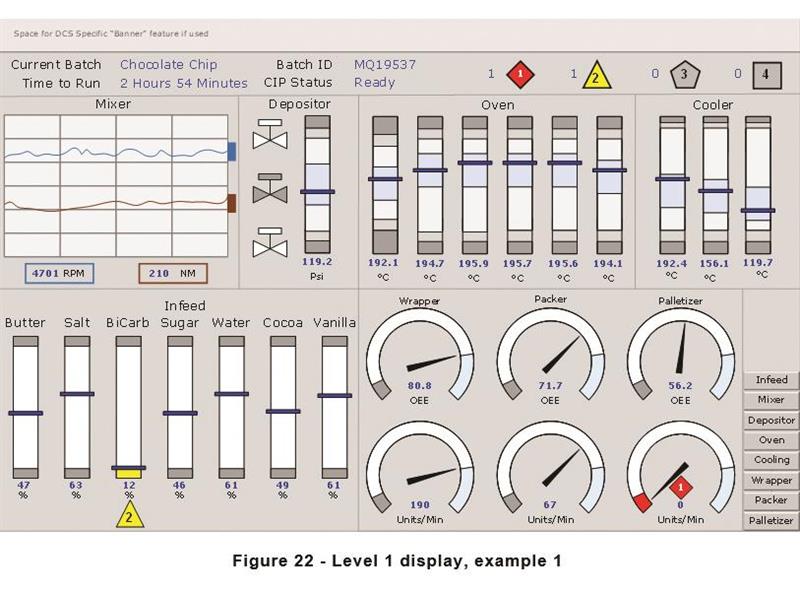
No one person could hold the entirety of a complex engineering process in the mind; the components are too numerous and the systems too complex. To help operators manage this complexity in a practical way, industrial processes are displayed at four different scales. The biggest overview of the entire thing is level 1, and is what is usually put on display in the back of a control room (incidentally, their physical design is covered by another standard, ISO 11064). Level 2 is where operators perform standard run mode tasks. Level 3 might contain P&ID piping and instrumentation diagrams. Level 4 is for diagnostics, and would offer a digital faceplate on individual valves, for example. (When designing a new plant, or modifying an old one, storyboards and task analysis help determine what kind of information should be displayed at each level).
The way that processes are displayed – whatever the level – has changed radically with computerisation over the past 40 years, states Rockwell Automation EMEA commercial project engineer David Board, who co-directed compilation of ISA-TR101.02-2019 with Ruth Schiedermayer, technical curriculum developer at Amatrol of the USA. That document is a technical report for the usability and performance of human-machine interfaces (HMI) based on the International Society for Automation’s 101 standard for such equipment originally published in 2015. Board says that it brings a human-centred design influence to complex engineered systems.
Looking back, in the days before computers, control boards were just that – lamps linked by electrical relays that functioned as a kind of analogue of the process. Changing an alarm was expensive, because it meant rewiring the board.
When computers came along, their multiplicity of analogue inputs and alarms made it simpler to mock up process diagrams. And when early EGA displays could be used to show them off, enthusiastic computer designers took full advantage of the 64 colours in the RGB palette to paint components in vivid colours, as well as simple animations – such as flames for boilers – to make them pop out visually.
Those ideas have now fallen out of favour because of two recent trends in design thinking, according to Board. First is increasing understanding of colour impairment. Some 8% of the male population are red-green colour impaired (the condition also affects women, but to a much lesser extent). This section of the population finds it difficult to discriminate between green and red; the two colours through their eyes look like similar shades of green. That means that dynamically colour-coding the status of a valve -- for example, green for open and red for closed – will completely fail to flag up its change in status for more than 8% of candidates for the position of operator.
The second is increasing research into situational awareness, the ability of people to follow what is going on as something happens. For example, Dr Mica Endsley breaks this down into three parts: awareness of the state of certain objects in the environment; comprehension of what they mean -- that is, what is actually happening; and understanding of the implications of what is going on. Greater awareness of how people follow events as they unfold can also support the design of systems that help keep them focused and on task in difficult or emergency situations.
“If you have things that are spinning or flashing, that switch between red for stop and green for go, changing, the operator is overwhelmed by information overload," summaries Board.
GOING GREY
The first design alteration suggested by the standard is draining away excess colour. Arrays of garish hues are reduced to a background of greys, whites and blacks. Still, this monochrome palette still provides high-contrast areas to display a change in status: black valves are closed; white are open. In addition, those two status words are displayed on the screen next to the valve. One is circled; the other has a rectangular box. So the display highlights the change in operational status of a component in two obvious ways: either by the high-contrast shift from dark to light, or by the way the word boxes change from one shape to another.
The second alteration covers the display of gauges. Like a common car speedometer, these may be drawn in a circular arc with a range of some parameter whose present status is indicated by the pointing of a needle. Board recalls from his earlier career how rows of gauges in a boilerhouse would be lined up and calibrated so that in normal operations the needles pointed straight upward; their divergence from vertical indicated that some parameter was starting to drift off of optimal.
So in the digital representation of the gauge, grey markers behind cover quadrants of the scale. If the normal operation range goes from 50-70%, then that is depicted as a white ground. At either edge of that could be a light grey field, and at further extremes a darker grey.
These could indicate alarm thresholds; ISA standard 18.2 deals with alarm priorities and severities. Protocols would dictate what position of the needle creates an alarm. When one goes off, it draws the eye by creating a flash of bright light, a number symbol flashes, and a square lights up red or yellow, depending on the priority.
“In terms of on/off, we have done a lot of work on contrast,” states Board. “If I take a triangle for an alarm signal, priority 2, I can highlight it by drawing a yellow outline rectangle. Depending on highlight colours, it can easily be lost. So if there’s a message, rather than an alarm, it might be cyan rather than yellow, because the contrast between them is minimal.”
In a further elaboration of the standard, such gauges could be straightened out to vertical bars, where the full range of the parameter runs from the bottom to the top. The needle pointer is replaced by a rectangle that moves up and down a vertical track to the side of the column. The set point could be added as for example a dashed grey line, as well as the high and low extremes of good operation. Multiple parameters can be displayed in a row of such columns. If they are, they could be arranged so that the normal condition arrows all form a straight line.
“In the original Star Trek TV series, when the crew were in the sick bay, there was a display with loads of vertical lines and arrows pointing. If I took an alien and put its statistics on that instrument, I could see if it were healthy,” argues Board.
TRENDING
Although such a display provides some context about whether a current reading is normal or abnormal, it still only portrays real-time information. To help identify patterns and trends of behaviour, a little graph of readings over time is displayed next to the column. For example, it can also help clarify the meaning of a simple shaded-rectangle tank-filling icon. In that icon, the level of shading goes up and down the scale in proportion to the fill. With the trend information, users can determine whether it is filled or empty.
Alternatively, the current value of a parameter could be plotted over time in a relatively large graph, alongside of which, lined up, is a pointy triangle that moves up and down into different quadrants (pictured top right). This provides context about whether the value is in good operational mode, in a border area or in alarm.
However, even with boundary edges and alarms, these vertical gauge diagrams can be difficult to manage when there are many parameters. What Board calls an old oil and gas industry technique that displays lots of data at once is a radar chart. Six parameters are arranged in a starburst coming from a single origin; the value increases along the lines as they extend outward. Their values trace the outer perimeter of an area; a shape. Changing parameters skew the dimensions of the shape as they raise or lower the position of a line. Humans’ peripheral vision can easily pick up on relatively small shape changes.
Box: One of four
TR2 is the first of four reports planned based on ISA 101. TR1, due to be published later this year, explains how to develop a high-level summary, the HMI philosophy; a nitty-gritty engineering specification, the HMI style guide; and the HMI toolkit, a library of representations of industrial components (objects). TR3, a draft of which was out for formal review in March, is about HMIs for mobile devices. TR4, currently being written, covers on-machine HMIs.
Note: This article was first published in the May/June issue of Engineering Designer, the journal of the Institution of Engineering Designers.
By Will Dalrymple